Ever hear of it?
Until last Thursday, I never had.
And then I saw TWO references to it in one day.
The first was a posting to Facebook by a friend, who had a link to a Steampunk event being held here in San Diego. I followed the link simply because of who had posted it.
She's a very creative lady, and I thought maybe she'd inspire me in some way.
And she did! Thanks Del...
The second was a posting by Sandi MacIver (
here) showing a card she'd made in the "style". Which, by the way, she doesn't explain, she just tells you to Google the term.
So, I did.
Sandi always inspires me, and since I've been playing with the stamps she featured on the card she posted, it piqued my interest.
I liked what she'd done with it, and as soon as I started checking out my Google results, I totally saw the style!
I decided to attend the Steampunk event on Sunday. This was the first time they'd ever held an event here, so it was a little discombuberated (sp?), but interesting.
A little background, if I may...
This genre is a mixture of Jules Verne (10,000 Leagues Under The Sea), Victoriana, magicians, and any number of pieces of equipment that are steam powered (hence the term Steampunk).
It includes anything you can think of that's Victorian, including corsets (for men and women!), hats,and feathers; First & Second World War outfits ( gas masks, pilot goggles, hats, airplanes, dirigibles, steam powered trains)...
I chatted with a few people who, like me, were NOT in costume (lots of costumes!) trying to find out what this whole thing was all about. It seems as though just about anything goes...
It also has strong ties to comic books and science fiction (think Jules Verne again) and anything with cogs and gears, and microscopes, and other scientific equipment (old fashioned types)...
Just different! But I must say, I had fun people watching!
Wanna see some pix I took while there?

This guy actually made his "backpack". The doors on the back of it opened.
I overheard him tell someone he'd started with an old army backpack (it looked leather, so maybe from WWI???) and actually used the straps for that as the straps for this contraption.

This couple were registering for the "Steerage" fee (the designation for a one day ticket).
She's wearing clothing from either WWI or WWII - it's clothing I remember seeing as a child. I was born at the beginning of WWII, so clothing 10-15 years older would not have been unheard of at the time.
He's more into the goggles and gloves of, maybe, a pilot??? I think he was wearing airline wings on his label.

Some people had on cut-away coats, which I think are from the Victorian era.
Others wore pilots caps (WWI) with goggles attached, like the photographer in this picture.

And this gentleman had a huge handlebar mustache, and wore an eyepiece that had lots of cogs and gears on it - it looked like it was supposed to be helpful at working on clocks and watches, maybe peering at microscope slides.
I overheard someone ask him something about a magic show, so I think he might have been the magician on the program.
As I said, it was interesting! I could see getting dressed up in some of these clothes - kind of a more modern Renaissance Faire type event... And I've always enjoyed Renaissance Faires!
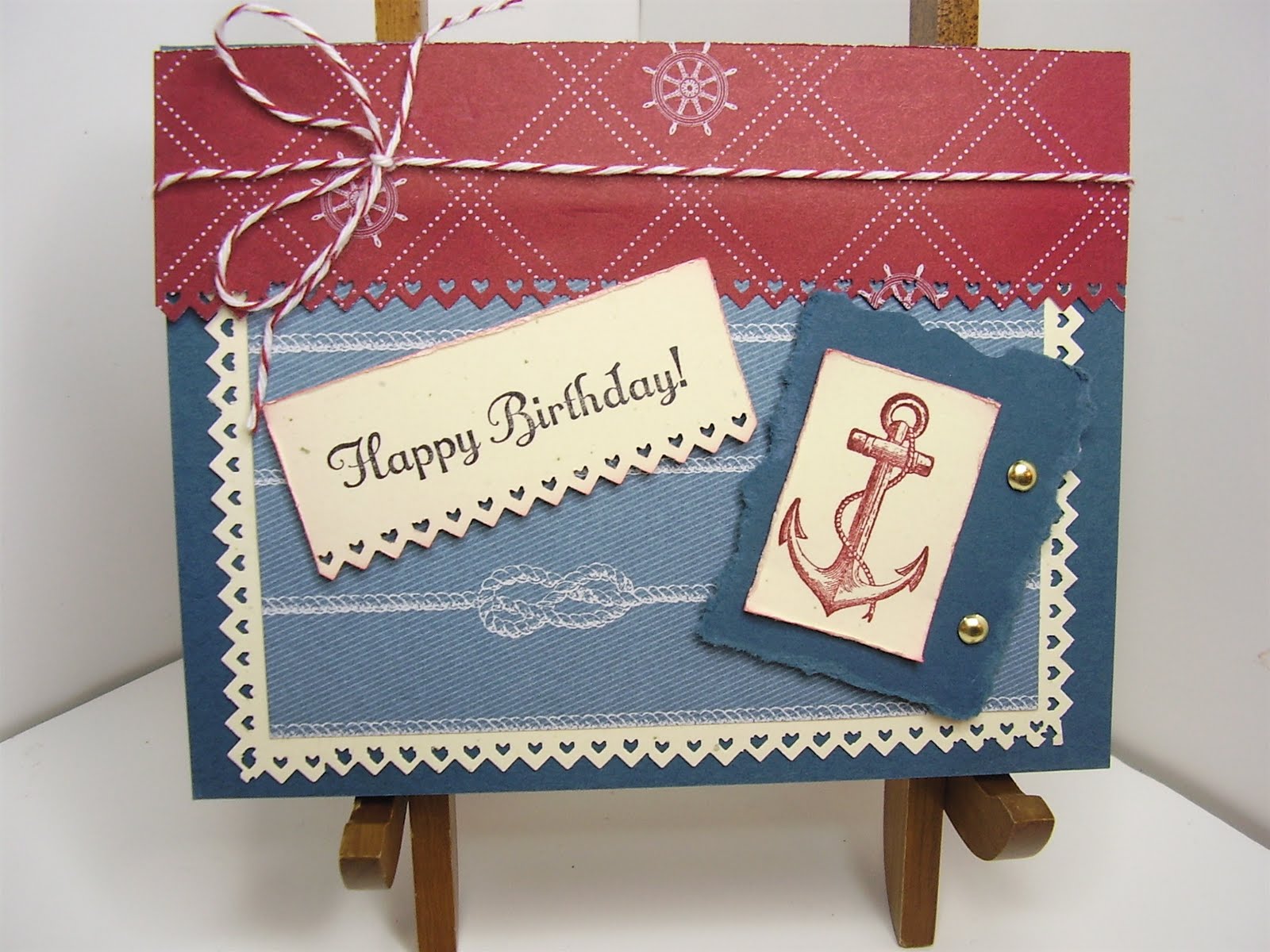
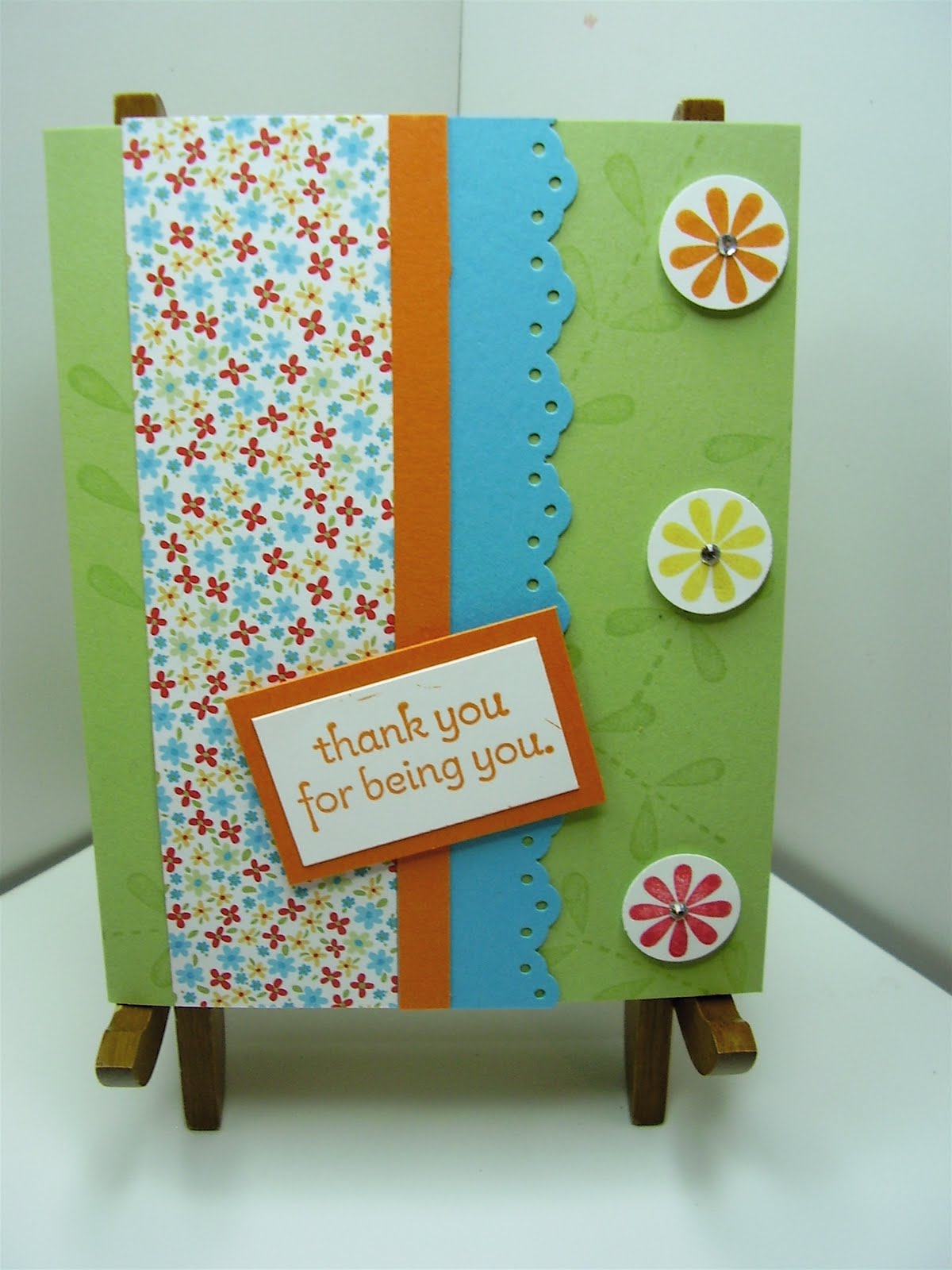
I made this card a couple of months ago - do you think it qualifies as Steampunk?

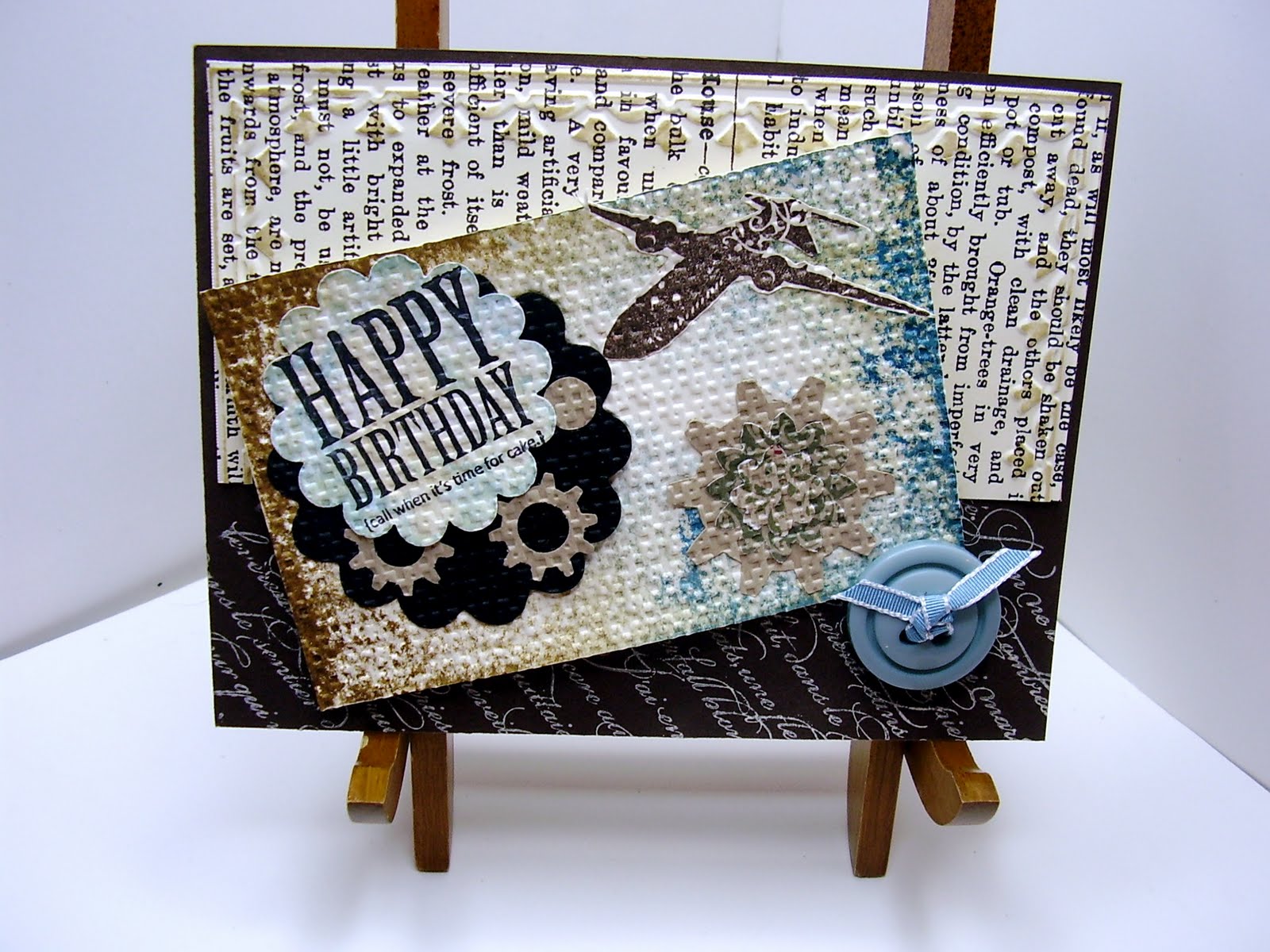
That's all I have right now, but I'm working on pulling something together, given some of our current stamp sets... It's a genre that's a little foreign to me, so the creative process is evolving!
So, - what's YOUR take on Steampunk? Had you heard of it before? Leave me a comment and let me know!
Thanks for stopping bye - come back soon!


 This is the inside of the box that will hold the cards.
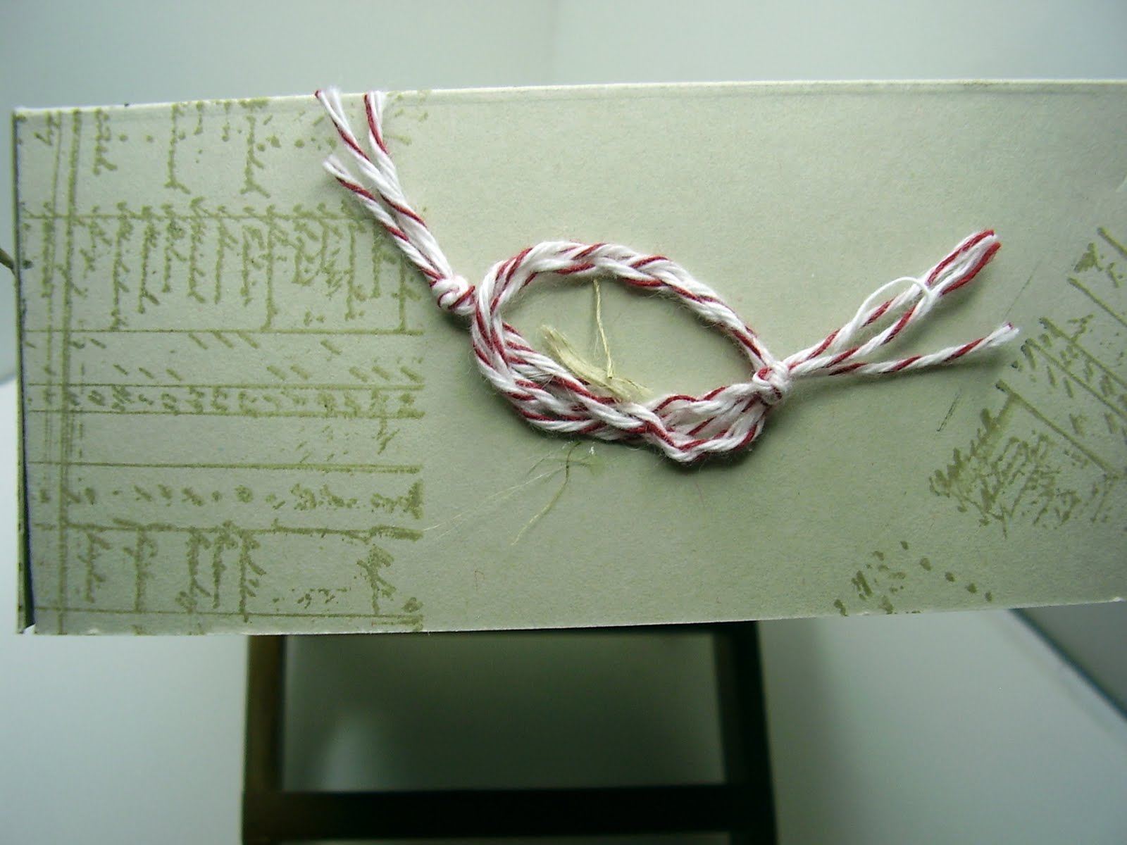


